Statement of Purpose
For the first two decades of Encore, the concept of corporate branding could be reduced to a basic logo. During those years, Encore changed its logo often. Beginning in 2000, exemplifying Encore’s reputation as a collaborative, expert publisher of arts programs and custom publications, we resisted change. Now, on the verge of our 50th anniversary, the time is right to embrace change.
Responding to our ever-evolving business and world, and incorporating feedback from our staff and partners, the new Encore brand reflects our modern needs, bringing a cohesive look, feel and voice across our consumer products, in business communications, and in the digital space. As friendly, reliable and steady as ever, the new Encore is simply a bolder, more confident version of the old Encore. We are the backbone for arts, culture and community in Greater Seattle and the San Francisco Bay Area.
Brand Goals
We strive to be not the background, but the backbone, for arts, culture and community, i.e. our brand should be memorable, visible and bold.
We endeavor to live up to the brand personality and vision defined in 2016, which means we should be “accessible” (friendlier), “polished” (classier), and “expert” (confident).
We want a consistent look, feel and voice across consumer products, in B2B communications, and in the digital space.
We wish to evolve the brand rather than revolutionize it; to bring to the forefront the inherent vision and personality that is recognized by staff and key constituents, but lacking in our outward communication and presentation.
Wordmark

Standard Wordmark
The standard Encore wordmark, to be reproduced only in black or white. See below for more usage guidelines.
Spacing
Clear space around the wordmark is defined by the encore “o”.

Sizing
Minimum size for the black wordmark, as seen below, is 0.4″ (50px) wide. Minimum size for the white wordmark is 0.75″ (80px) wide.
Orientation
The wordmark, as on program covers, may appear vertically. The top of the mark should face the program Spine.
Color
Preferred background color combinations below. Unacceptable combinations are marked with an X. (In short: no white on light backgrounds, no black on dark backgrounds, never color the wordmark.)


Tagline Variant
While not the Primary wordmark, the Tagline Variant is used to establish the brand on most public-facing materials, including sales collateral, business papers and email newsletters. It need not appear more than once per document. Unlike the Primary wordmark, it should only appear on white or reversed on black.

Note the slight difference from the Primary wordmark in the Tagline Variant’s clearspace definition.
The Tagline Variant is for use on either white or black background only.

On black background, the wordmark reverses to white. The tagline remains Encore Red.

50th Anniversary Variant
For use only on white (with red accent) or black backgrounds (with warm grey accent). This mark will be utilized solely from August 1, 2019 to July 31, 2020, including on program covers.

Product Variants
For use only on white backgrounds, these Product Variants of the wordmark are to be used only to call out specific Encore product lines in Sales Materials. These variants utilize the same clearspace measurement as the Tagline Variant.
To create new Product Variants:
- Begin with a 2.5″ wordmark.
- Right justify type in 18pt lowercase Proxima Nova ExtraBold, in Encore Red.


Color
Primary
Our primary colors are black and white, each of which allow the colors on our covers, in our promotional photography and in our brand illustrations, to enhance the character of the brand. The wordmark and Cover Spine must always appear in black or white. For tints between black and white, use Encore Grey (gray).
75 / 68 / 67 / 90
0 / 0 / 0
#000000
PMS Black
0 / 0 / 0 / 0
255 / 255 / 255
#ffffff
PMS White
Secondary
Encore Red is used as an accent color, most noticeably as the Spine color in sales materials, and the tagline color in alternate wordmarks. It should not be diluted into lighter shades.
7 / 94 / 65 / 31
158 / 48 / 57
#933039
PMS 1807
Tertiary
Encore Gray and its tints are used as a background color for table headings, callout boxes, web buttons and links, et al.
7 / 10 / 22 / 20
190 / 185 / 166
#beb9a6
PMS 7535
90%
80%
70%
60%
50%
40%
30%
20%
10%
Additional colors
For use in sales materials, illustration and other collateral applications.
7 / 35 / 100 / 13
197 / 146 / 23
#c59217
PMS 1245
90%
80%
70%
60%
50%
40%
30%
20%
10%
71 / 90 / 9 / 37
83 / 46 / 96
#532e60
PMS 525
90%
80%
70%
60%
50%
40%
30%
20%
10%
100 / 52 / 2 / 12
0 / 84 / 159
#00549f
PMS 2945
90%
80%
70%
60%
50%
40%
30%
20%
10%
84 / 0 / 54 / 0
0 / 181 / 136
#00b588
PMS 339
90%
80%
70%
60%
50%
40%
30%
20%
10%
Typography
Title
Roboto Condensed Light is used sparingly for major headings, page titles and as display type. Its size should typically be 3 more times that of the Body Copy, and should always be black or white.
Roboto Condensed Light
ABCDEFGHIJKLMNOPQRSTUVWXYZ
abcdefghijklmnopqrstuvwxyz
0123456789 “ ” ‘ ’ ?!@#$%^&*()[]
Heading
Roboto Black is to be used for any paragraph headings, table headings, etc. Sizing must be greater than or equal to Body Copy but less than half of Title. Headings should primarily be in black, with red used as a highlight for elements like dates.
Roboto Black
ABCDEFGHIJKLMNOPQRSTUVWXYZ
abcdefghijklmnopqrstuvwxyz
0123456789 “ ” ‘ ’ ?!@#$%^&*()[]
Body
Roboto Light is the primary typeface for all copy, accompanied by its Roboto Light Italic for emphasis and Roboto Medium for bold text. Set body copy at a size between 8pt and 12pt, always in black or white.
Roboto Light
ABCDEFGHIJKLMNOPQRSTUVWXYZ
abcdefghijklmnopqrstuvwxyz
0123456789 “ ” ‘ ’ ?!@#$%^&*()[]
Roboto Light Italic
ABCDEFGHIJKLMNOPQRSTUVWXYZ
abcdefghijklmnopqrstuvwxyz
0123456789 “ ” ‘ ’ ?!@#$%^&*()[]
Roboto Medium
ABCDEFGHIJKLMNOPQRSTUVWXYZ
abcdefghijklmnopqrstuvwxyz
0123456789 “ ” ‘ ’ ?!@#$%^&*()[]
Download Google Fonts— Roboto / Roboto Condensed
Composition
Compositional Grids
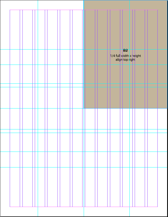
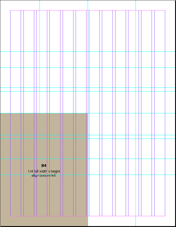
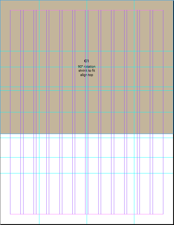
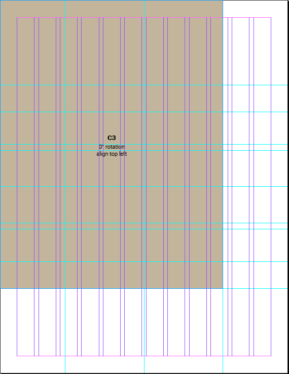
Gridded InDesign templates are available in an array of commonly used sizes and page orientations. These templates utilize a 12-column grid for body copy.
The compositional grid is built from the boundaries of the layout itself. See below for examples of grid construction and execution examples.
When to use Spine vs. when to use Standard?
For layouts with the Spine, note that it should ONLY be on the left side of a layout, and should always be .25″ wide, except in layouts with a width less than 4″. In those cases, the Spine should be .125″.


Download InDesign Templates—
Download Office Templates—
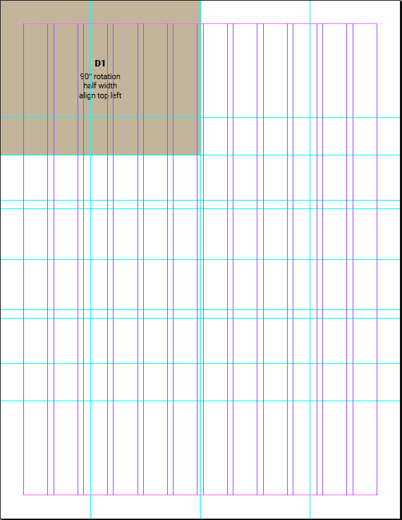
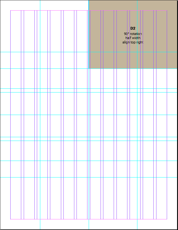
Compositional Grid Construction
The compositional grid is built from the boundaries of the layout itself, in the following standardized arrangements. (Letter-sized, portrait orientation shown below for Standard layouts.)


Compositional Grid Usage
Placement of objects in the grid do not and should not match the sizes used to generate the grid. Photography and color blocking should bleed left to right and/or top to bottom across the page. (Illustrative elements may float within the compositional grid.)


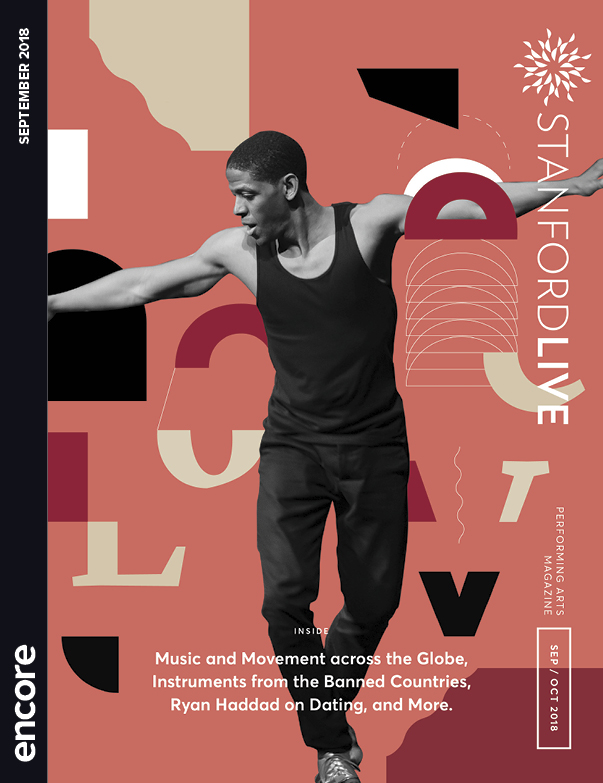
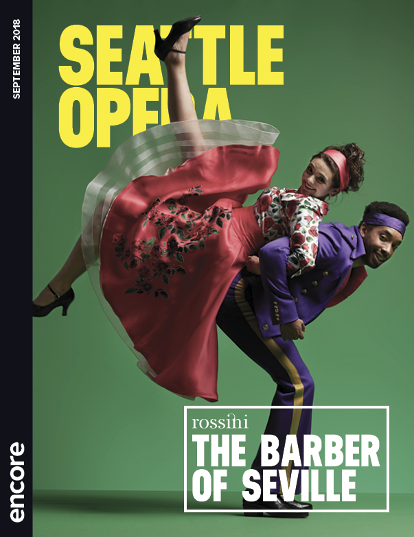
Program Covers
The program cover, in both Standard and Digest sizes, is the most visible instance of the Encore brand. It is also where the Encore brand personality traits of Expert and Genuine shine through. The Spine element, established here and integrated (if in a slightly different form) throughout the brand, announces Encore as the backbone of the arts experience, enhancing and enriching the live performance before and afterward without taking focus away from the art, artists and organizations themselves.


Download InDesign Templates—
Program Masthead and Folio
The program masthead is an ideal place to build upon the Encore brand. It is a space we could use to either further unify the programs across organizations, emphasize our history with individual organizations, spotlight local artists and illustrators through commissioned work, or add some of our own brand personality via illustration, allusions to web content, behind-the-scenes staff photography, et al.
Photography
Photography usage needs to rely heavily on collaboration with our publishing partners. In all use cases, our emphasis should be on people/faces to demystify the reasons to support us, our partners, the arts, etc, with a ratio along the lines of:
- covers alone 10%
- people / lifestyle 40%
- people with programs 20%
- stage performance 30%
We plan to source these images from our arts partners. When this library of content will not serve us, we may use stock images. As budget allows, we will do our best to build up our library of photographs with original/commissioned work.
Illustration
Illustration guidelines are in progress, but for now here are some key places where we might best utilize illustration:
- Program Masthead
- Website(s)
- Sales Materials
- Social Media
- Editorial Content (in print with Stages, online with Encore Spotlight)
Tone of Voice
For both consumer and business audiences, the Encore tone of voice is a crucial part of the Encore brand, especially to communicate our “accessible” and “genuine” nature, but also to put our expertise front and center.
In both B2B and B2C realms, Encore is friendly and familiar without resorting to casual or flowery language, as well as authoritative and bold, though never to the point of rudeness nor closemindedness.
Encore’s tone of voice permeates all business- and consumer-facing materials, but is especially the focus of these example elements:
- expository copy of B2C materials
- sales campaigns (emails, social, etc)
- media kit
- website (non-editorial)
- social media
- editorial content (stages, website)
Addressing Missing Pieces
The Marketing team has gone to great lengths to provide commonly used collateral for any existing needs for branded content, but there are bound to be new opportunities that arise and require new materials to support them.
From premade templates to the compositional grid construction guidelines, most future materials can be created quickly and easily to play within the existing brand guidelines. But, there will surely be instances where the guidelines do not or cannot fully address future needs.
At that stage, please bring to the Marketing team your request, at which point it will be assessed. If, upon review, it is determined that an update to these Brand Guidelines is required, that change will be made and all staff will be notified of the update.